Oldest Airline Liveries in service
The airlines in this list may surprise you.

An article posted in April 2023 by Rohan Anand suggested that some airlines need to change liveries. For the past two years, I’ve been creating a database of historical liveries, documenting the lifespan of airline liveries and the frequency at which airlines change liveries. Fun fact:
The average lifespan of an airline liveries is 11 years.
But some airlines have gone over this average, the longest currently running close to 40 years. Do these liveries stand the test of time or do they look more like aircraft that fell out of a time machine into the wrong era?
Philippine Airlines (1986)
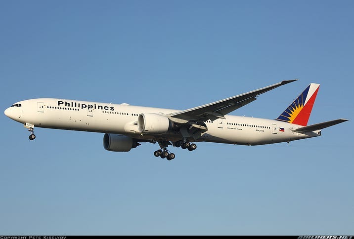
Currently, the oldest active airline livery is Philippine Airlines. The livery was introduced in 1986, which means it is currently close to 40 years old. The livery is an iteration of previous liveries but includes the Philippine sun motif on the tail design.
Clues that give away the age of this livery is the font used for titles. It’s the standard Arial, in italics. They couldn’t have thought of a less creative font.
While the livery is old, Philippine Airlines recently applied the livery to a brand new Airbus A350. It is strange to see the blend of modern and retro but it is oddly satisfying to watch and behold the combination. Besides the font, there is nothing really telling that this livery comes from the 80s.
2. Air China (1988)
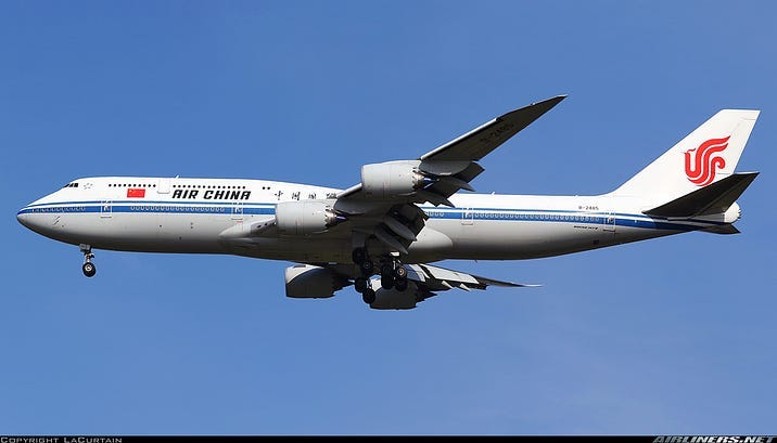
Launched in 1988, this Chinese airline has only had one livery in the entirety of its 35 year history.
After the government’s decision to split CAAC Airlines into six separate entities with their particular markets, of those six, Air China, China Southern and China Eastern still operate today.
Air China inherited the CAAC livery, but revised the tail design by replacing the Chinese flag with a phoenix logo which still exists today. A fun fact is that the logo actually spells VIP if you look closely. Air China also replaced the titles on the fuselage to reflect their new name.
Unlike Philippine Airlines, this livery uses elements from the that era: bold use of cheatlines. Air China also opted to use an industrial dark grayish brown color for their underbelly which makes the livery look even older. Air China has all the modern aircraft types: Airbus A350, Boeing 787 Dreamliners and even a Boeing 747–8, but none of those aircrafts can hide the fact that this livery has aged terribly.
3. Tunisair (1991)
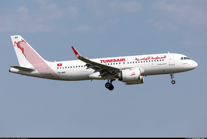
This is a lesser known airline but still a flag carrier nonetheless. Tunisair has always had an antelope for a logo. Although I was a fan of their previous logo which consisted of a T and A with an antelope, the antelope still remained in important element in the current livery which was introduced in 1991.
The livery itself is simple: an antelope with stripes running down from the tail to the fuselage. The livery itself is not very creative. Besides the T and U of Tunisair linked together (in Arial Black font?), it remains rather uninspiring. The most spectacular think about this livery is that is has survived 32 years.
4. China Southern Airlines (1992)
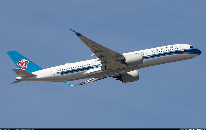
Another airline to survive the CAAC split up in 1988 was China Southern. However, immediately after the split up a group was headquartered in Guangzhou without an official name or brand. China Southern was officially established and based there on 1 February 1992 with the current brand image.
Despite being launched later than its sister companies, China Southern definitely had the most modern brand image of the Big Three. The livery is also cheatline based, but the design itself is more complex masking the livery’s age. On the tail, the kapok logo has remained unchanged since its inception in 1992.
Unfortunately, the cheatline is not always consistently applied across all aircraft, especially with the Airbus A380 where it looks like its got a giant bulbous blue nose. Nevertheless, my favourite variant of the livery is on the Airbus A350.
5. Shandong Airlines (1997)
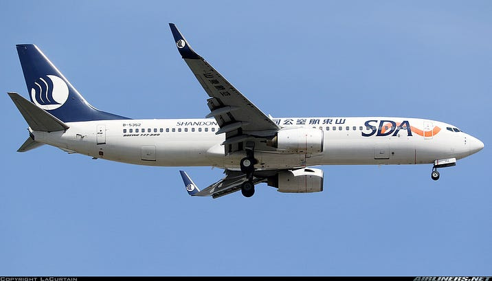
Another lesser known airline to make the list is Shandong Airlines. While it was established after the CAAC split, it has had the same livery since 1997. The livery is once again eurowhite, with the logo imposed on a navy blue background. In recent years, Shandong Airlines started painted quite a number of special liveries, but the standard mainline livery has remained the same.
There may possibly be another livery prior to this the current one, but I will need to do further research.
Honorable mentions
South African Airways’ current livery was launched two months after Shandong Airlines and just missed out on the top 5 list.
Singapore Airlines’ livery has been around since 1987, but in 2006 the livery was slightly revised to accommodate the introduction of the Airbus A380. The titles and tail logo was enlarged.
Similarly, Korean Air’s livery is been around since 1983, but the titles were also enlarged in 2007 in a modified version of the livery.
Other liveries that were introduced before the turn of the millennium are British Airways (Chatham Dockyard standard livery) and Sri Lankan, both launched in 1999.
Takeaways
Looking briefly at the top 5 list, there are some key takeaways:
Three are Chinese airlines
The question has been doing the rounds in the aviation circle is why are Chinese liveries so bland? China Eastern who was launched on the same day as Air China rebranded in 2014, but their new livery was coined one of the most boring liveries of all time.
Some may say the Chinese government imposed restrictions on what liveries airlines may have, which may explain why Chinese airlines are so fond of special liveries. But it’s no excuse for unimaginative boring liveries. With such a big market available to them, one can understand that a livery will not make much of difference to the profit line and hence, airlines do not pay much attention to it.
Three are standard eurowhite liveries, with logos on the tail, the other two are cheatline liveries
These two livery techniques have been coined the staple of airline liveries. While cheatlines were used to make an aircraft look sleek and exude a feeling of premium elegance, eurowhite was mainly used as a cost cutting strategy. Made famous by airlines in Europe (hence the name), this strategy uses white paint, which is also lighter and this burns less fuel. That is also why airlines still adopt the eurowhite strategy today (see Iberia, Aer Lingus, TAP Air Portugal etc).
The cheatline has become less popular with few airlines adopting a cheatline livery if they rebrand. With more and more brands adopting a minimalistic design language, cheatlines have become more and more scarce. While I don’t see Air China and China Eastern changing their liveries soon, they do sport a dying breed of livery styles that actually make them rather unique in this day and age.
They all either contain blue, red or both, with Philippine Airlines adding a hint of yellow.
So now you know, if you want to stand the test of time include these colours in your liveries.
Jokes aside, blue has always featured heavily in airline liveries (complete the sentence: the sky is …). Some have even put it in their name such as JetBlue and Air Blue. Red on the other hand is significant in Chinese culture as a sign of luck and prosperity. While this list contains three Chinese airlines, it comes as no surprise that red is included in this list.
So there you have it. These liveries have been around the longest. Regardless of whether you like them or not, it is no small feat that these liveries have stood the test of time and are still active today. Are they due for a change? Perhaps. But they are still around, let us appreciate the fact that they also give us glimpse of what the aviation world looked like twenty or thirty years ago.
Is there a livery that I missed? I am currently doing this research with limited resources so if you have any inside knowledge, please leave a comment and help me out.
Technically, the typefaces for PAL and Tunisair aren’t Arial, but Helvetica: you can clearly see it in the latter with the S-shaped descending stroke in the R.